Key findings
- The core is good: solid level design, real challenge and a well-tuned difficulty curve.
- Coin packs scale cleanly from 252 to 1,252 coins/$, but the "60% more" badge sits on the $3.99 pack, not on the best-value one.
- The $2.99 Starter Pack claims "500% more"; its real value is roughly ×1.3.
- The UI is inconsistent: Every Word Capitalized, quantities shown as "01" and "X5", padlocks with and without level numbers, markers on some icons only.
- The very first screen is a notification request, before the player has any reason to allow it.
First Impressions After 50 Levels
Below is my first impression of the game. I completed 50 levels — enough to form an expert opinion. By this point, most of the game's features are unlocked, several days and multiple sessions have passed, and natural retention-based selection has largely done its work — along with a significant portion of payer conversion. Let's see what's wrong with the game.
Notification Prompt on First Launch
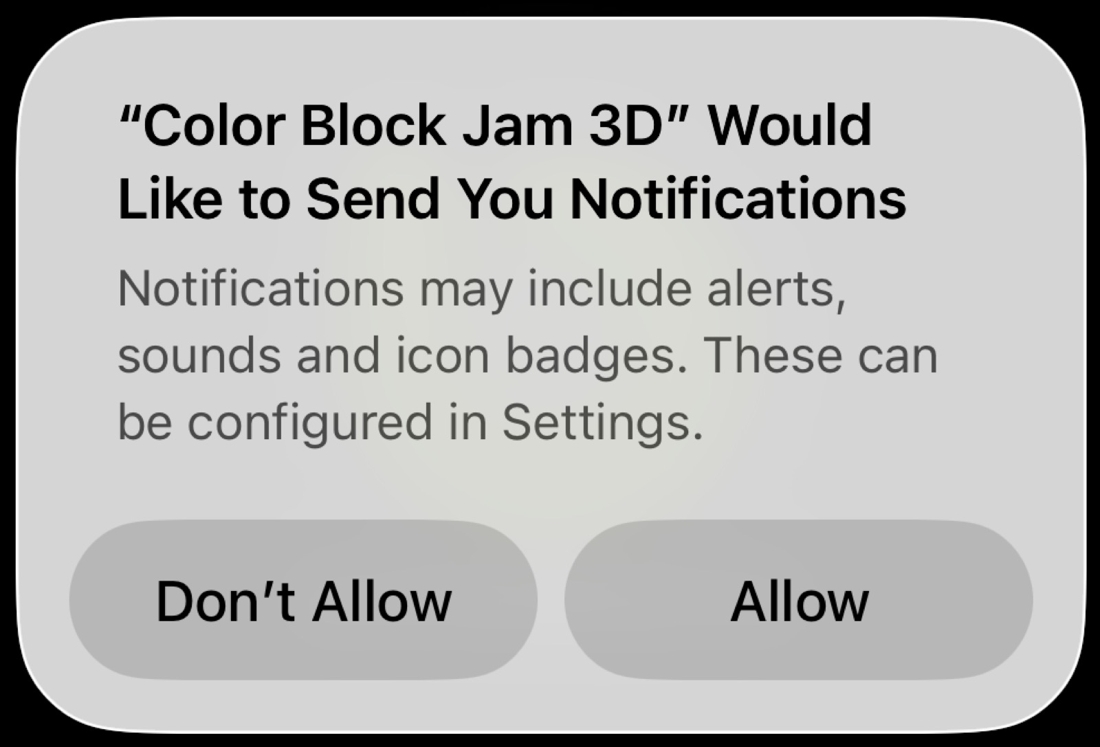
The very first screen isn't the game — it's a request to allow notifications. This is bad practice. Conversion here cannot be intentional: I have no motivation to receive notifications yet. The game is banking entirely on my automatic approval, hoping I'll just tap through. Instead, it distances me from the game and starts our relationship with friction.
Privacy Policy & Terms of Service Screen
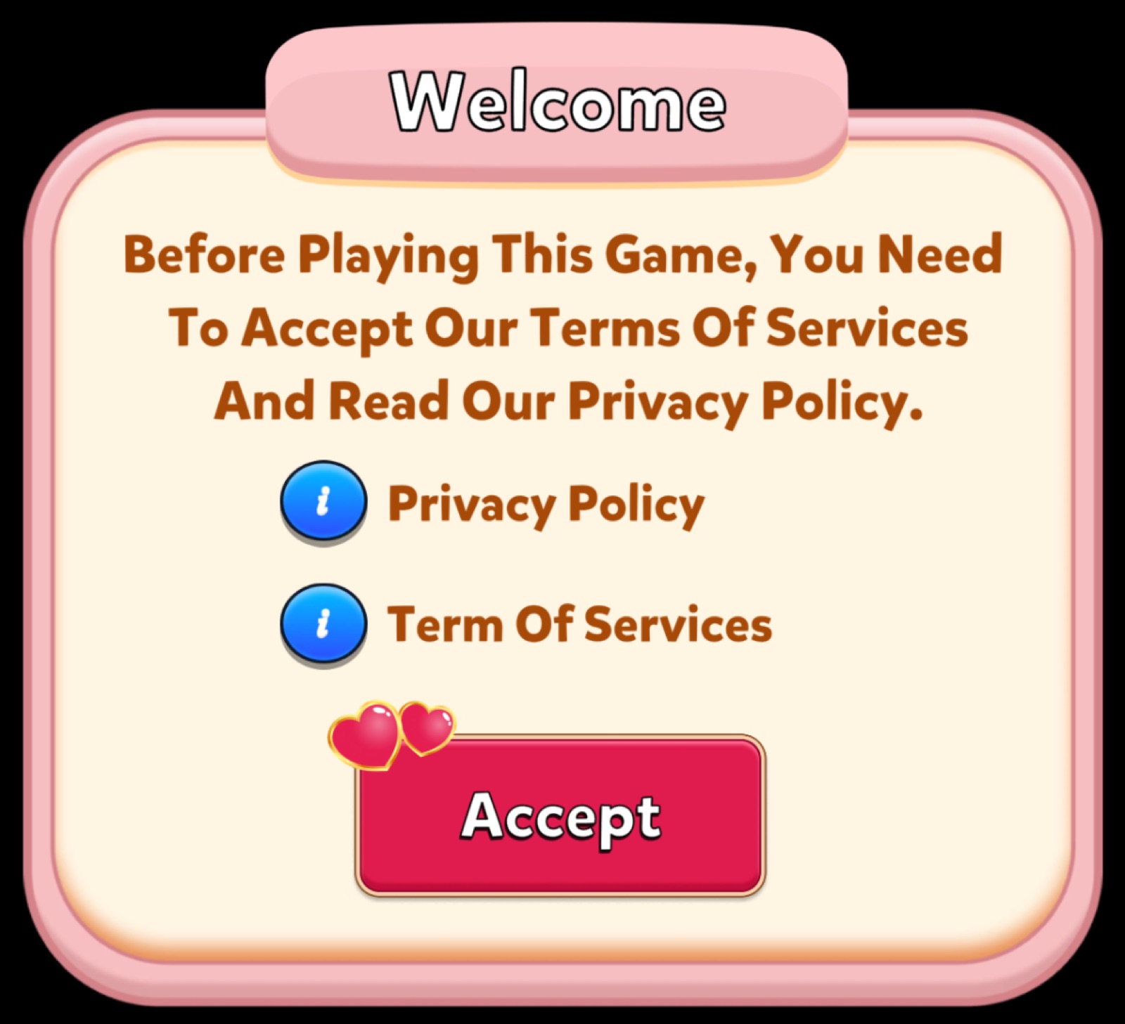
The PP and TOS window is written as if every word in the English language must begin with a capital letter. It's immediately clear that English is not the developer's native language, and they chose not to invest in quality localization. Another unpleasant first impression.
Level Complete Screen
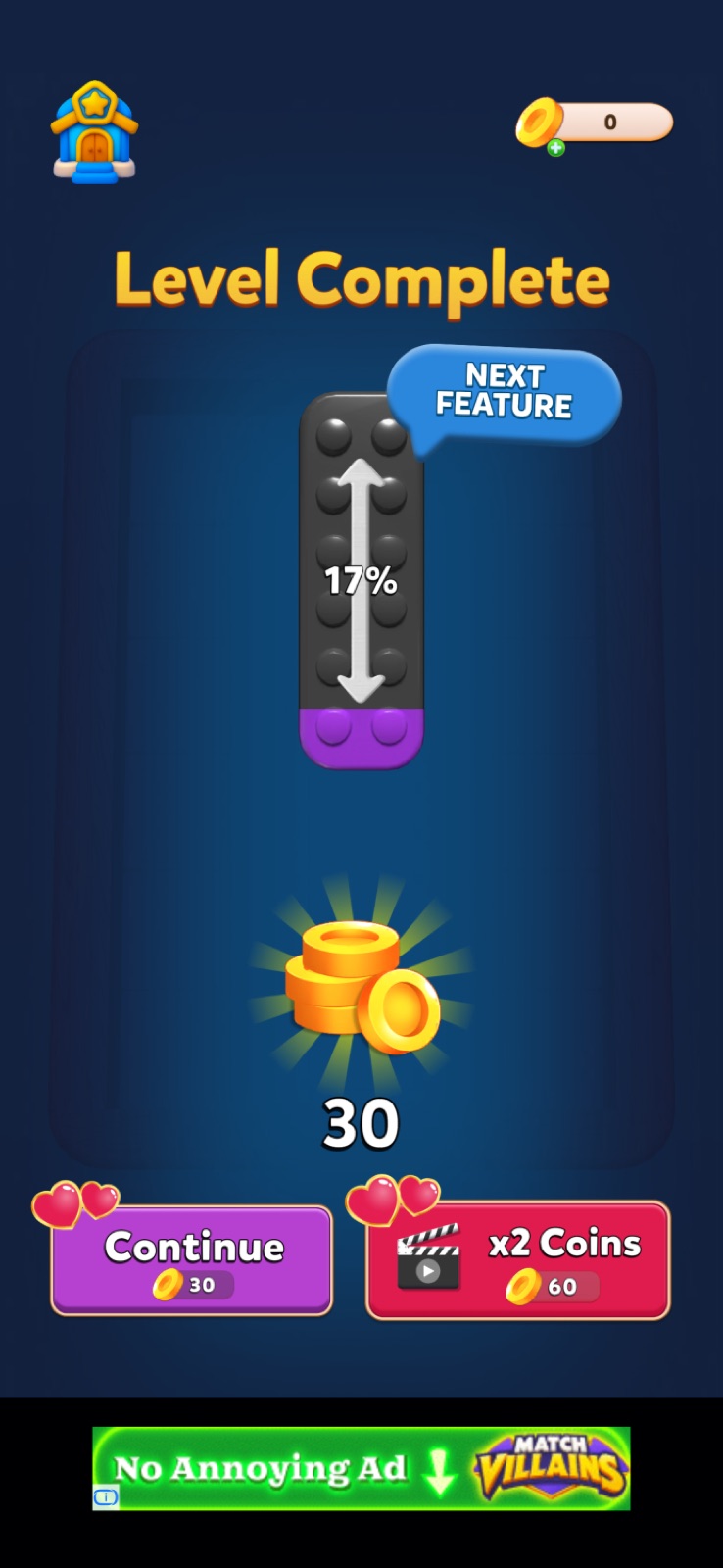
Winning the first level reveals an interesting feature — a progress indicator showing how far I am from unlocking the next feature. Good solution. But the buttons below are immediately confusing.
Traditionally, buttons display a price. So it looks like I'll have to pay to continue — and pay twice as much to continue after watching an ad. This is an extremely odd design choice that will keep annoying me throughout the entire session.
In reality, these are also reward collection buttons for completing the level. But this creates screen overload with unnecessary elements: the reward is already displayed in the center of the screen. A "double reward for watching an ad" option could have been placed elsewhere — or replaced with a mini-game where a moving arrow lands on sectors with different multipliers. That mechanic appears in many games, adds motivation, and feels earned. Here, the red button immediately signals stop, not reward.
Main Screen — Feature Gating
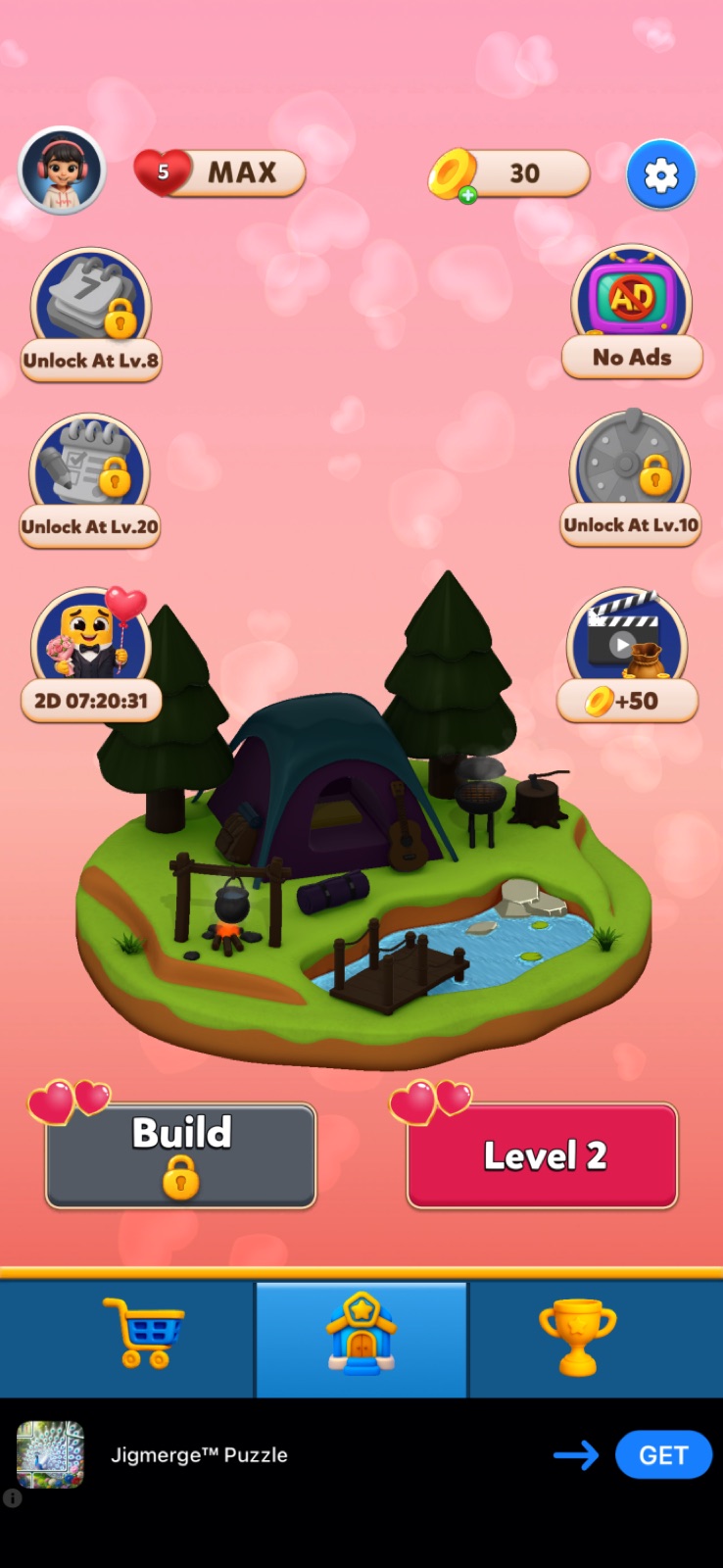
Arriving at the main screen for the first time, we see features and mechanics locked behind player level — traditional padlocks with level numbers shown. However, this approach is inconsistently applied. The construction button shows only a padlock with no level number, and the leaderboard button has no padlock at all — the level 30 requirement is only revealed after tapping through to the leaderboard screen itself.
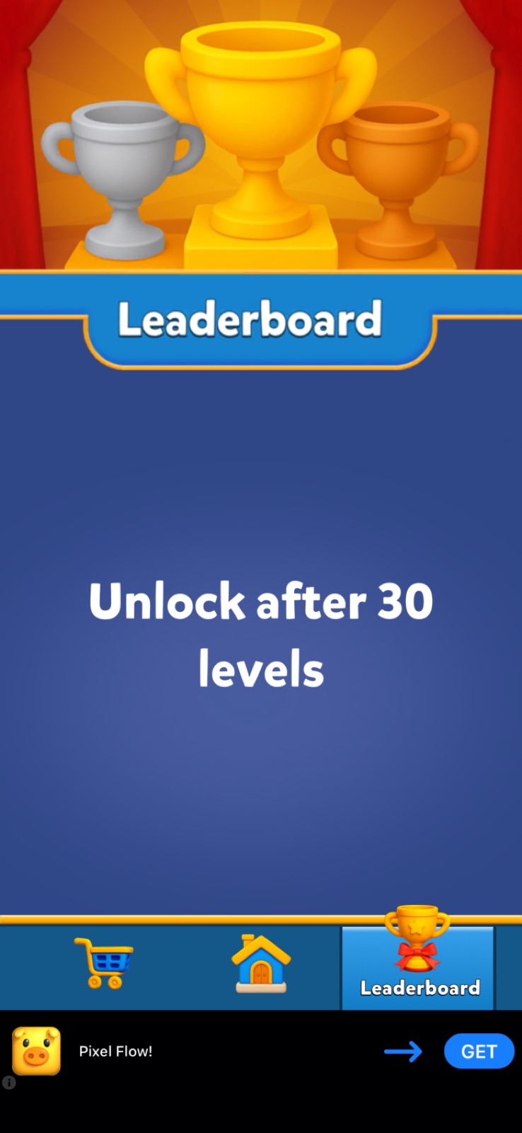
Overall, the game signals that it will keep offering something new for at least 30 levels, which does spark genuine curiosity.
Main Screen Offers
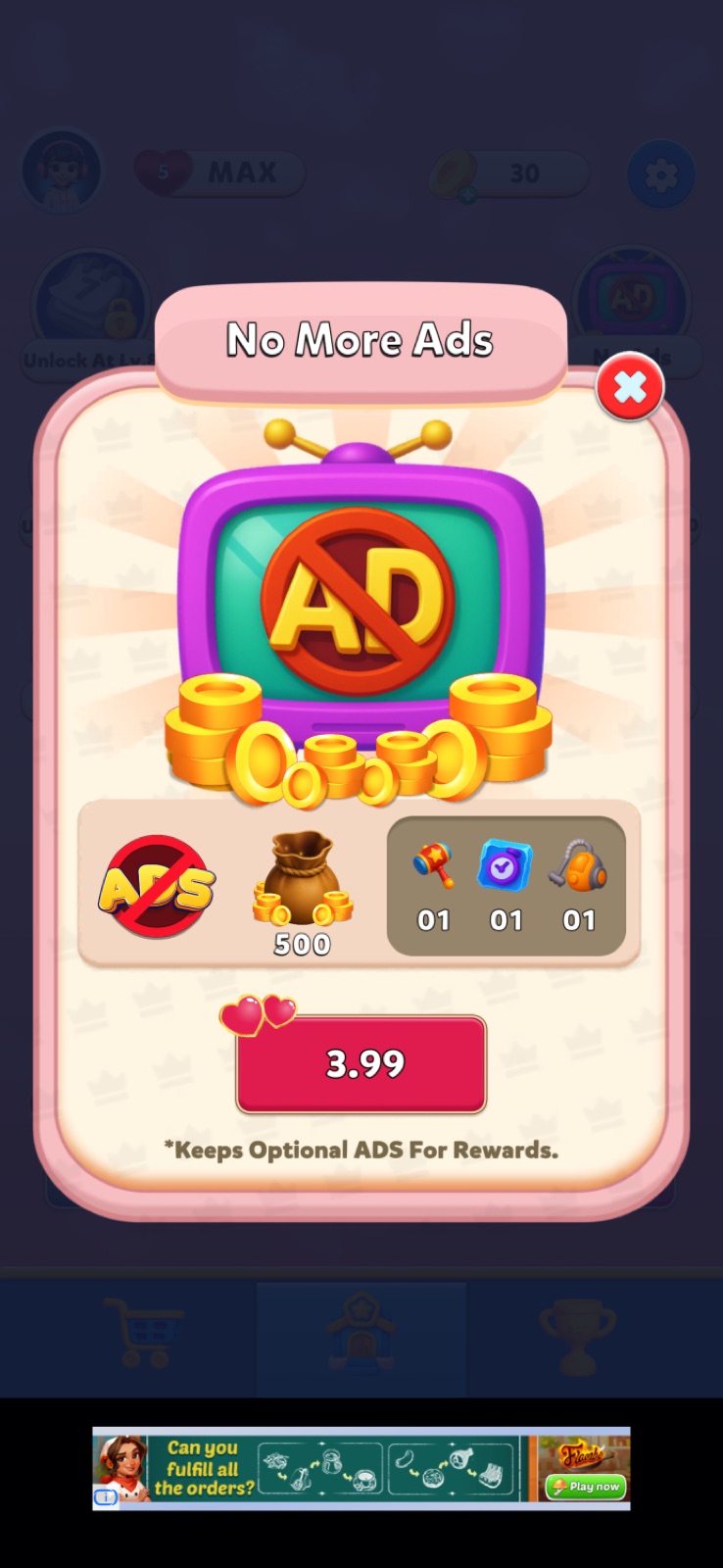
The main screen immediately shows a no-timer ad removal offer, plus a Valentine's Day event offer with 2+ days remaining.
There's also a "watch an ad to earn coins" button. Normally this type of slot is embedded directly inside the shop — but as we'll see, there's no such slot there. This is a bad practice I cover in my book Game Shops: Ultimate Guidelines.
Again, every word starts with a capital letter. And something strange is happening with item quantity numbers — they're displayed as "01" instead of "1" or "×1". Why the leading zero? Still unclear. But it significantly hurts the perceived UI quality.
Valentine's Day Offer
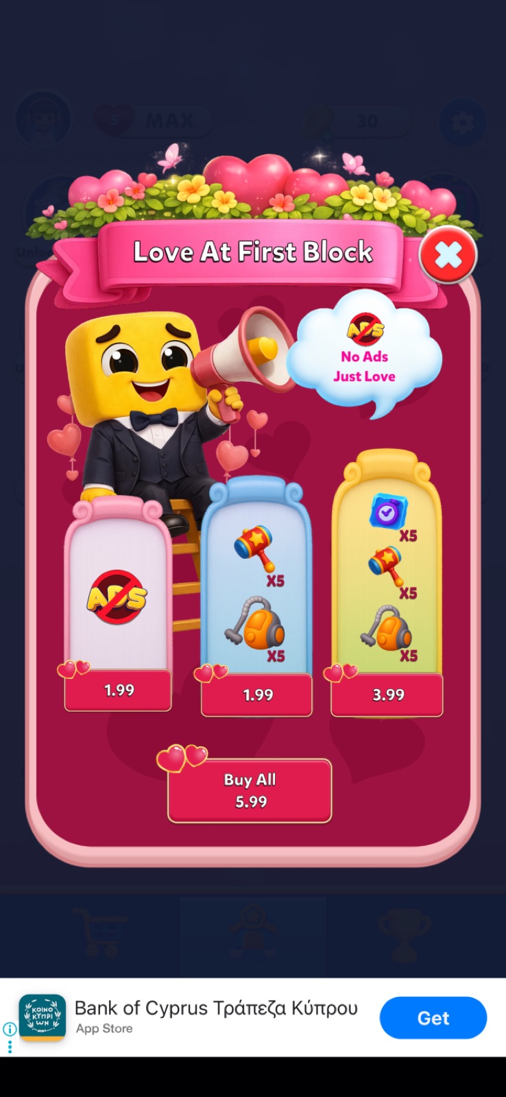
The Valentine's Day offer is a 3-in-1 bundle group with an option to buy everything at once with a discount — a solid mechanic in principle. But the execution is full of issues.
Item quantities here are written as "X5" (inconsistent with the "01" format elsewhere), the buttons are that forbidden red again (ugh), and there's no timer inside the offer screen — even though a countdown was visible from the outside. The "buy all" option saves $2, but this is nowhere highlighted with a discount badge or extra value callout. The importance of badges is something I also cover in detail in my book.
The Shop
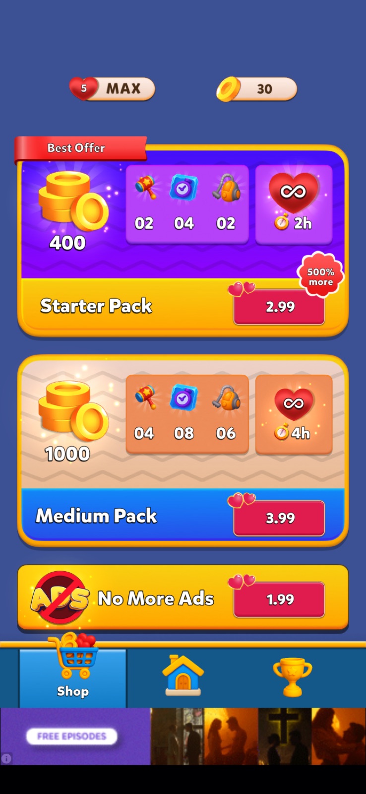
The shop is a topic I could spend a whole separate article on, but let's do a quick pass here. Again, the strange item quantity format in bundles. The "500% more" badge on the Starter Pack is confusing — 500% more than what, exactly? There's a similar "60% more" badge on the mid-tier coin pack, and it's equally unclear whether this is a comparison to another pack or something else entirely. And why is it only on the mid-tier pack?
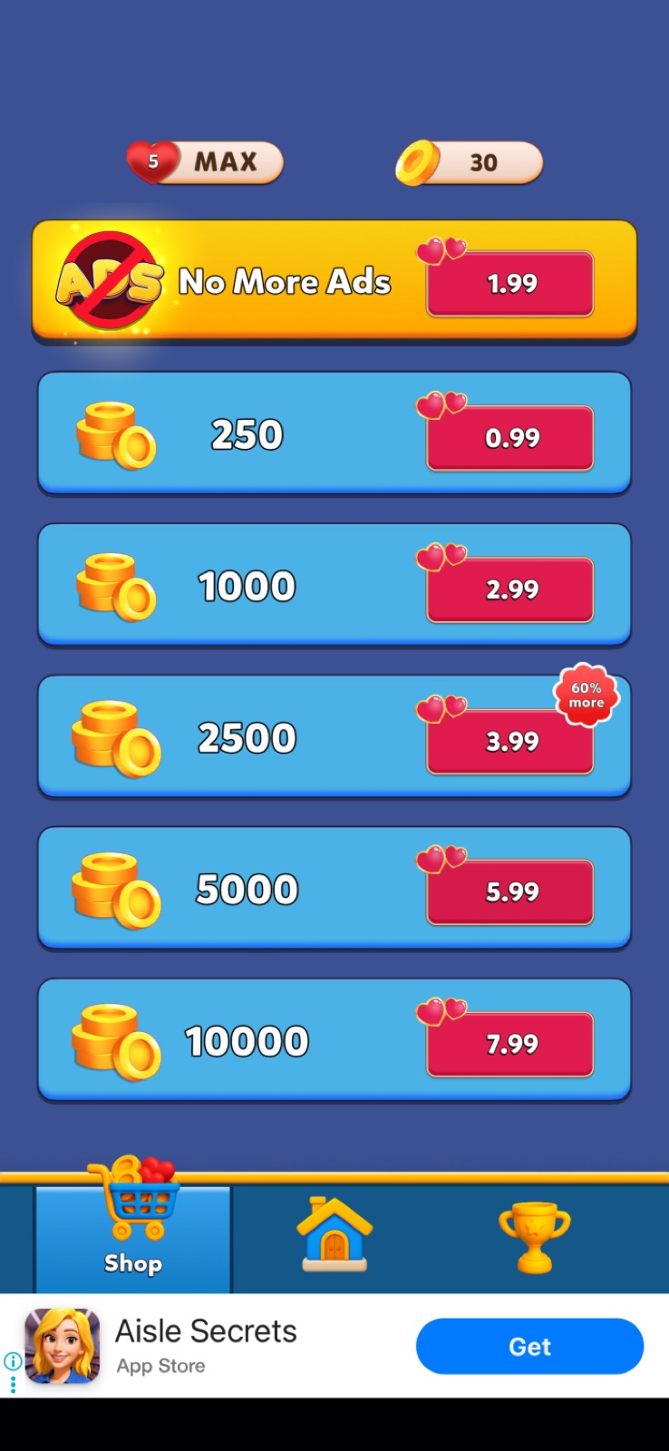
The shop spans two screens. Here's the quick breakdown.
Currency pack progression is actually clean — value scales monotonically from 252 coins/$ at the entry pack all the way to 1,252 coins/$ at the top. No arbitrage traps, no broken rungs. This is one of the few things the shop gets right.
But the "60% more" badge is placed on the $3.99 pack — not the best-value pack in the lineup. The $5.99 and $7.99 packs offer dramatically better rates (835 and 1,252 coins/$ vs 627). Highlighting a mid-tier pack as the standout deal misleads players away from higher-value purchases. A misplaced badge is almost as damaging as no badge at all — it misdirects rather than guides.
The "500% more" claim on the Starter Pack ($2.99) is the most aggressive overstatement in the shop. The pack contains 400 coins plus some boosters and 2h of lives. At the base pack rate, those 400 coins are worth about $1.60. Add boosters generously — maybe $1.50 total. That's roughly ×1.3 real value, not ×5. Players who do the math will feel misled (→ Game Shops: Ultimate Guidelines, ch. 10 Pricing Psychology & Anchoring).
No More Ads at $1.99 is priced below the entry coin pack ($0.99 gets you 250 coins, $1.99 removes ads). For a hyper-casual audience, this is an easy first purchase — well-positioned, no complaints.
What's missing: no free daily reward slot, no rewarded ad slot embedded in the shop. The "earn coins by watching an ad" button lives on the main screen instead — a fragmented experience that breaks shop habit formation.
Player Profile Screen
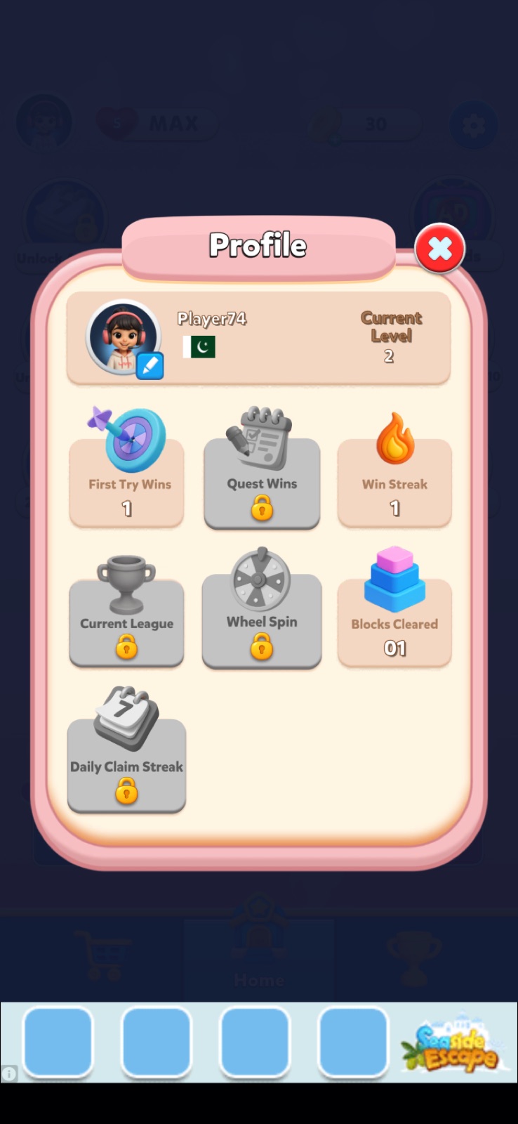
The player profile screen is yet another mess of numbers and quantities, with no level numbers shown on the padlocks. The impression is that this UI was never seen by a QA tester.
Level Screen
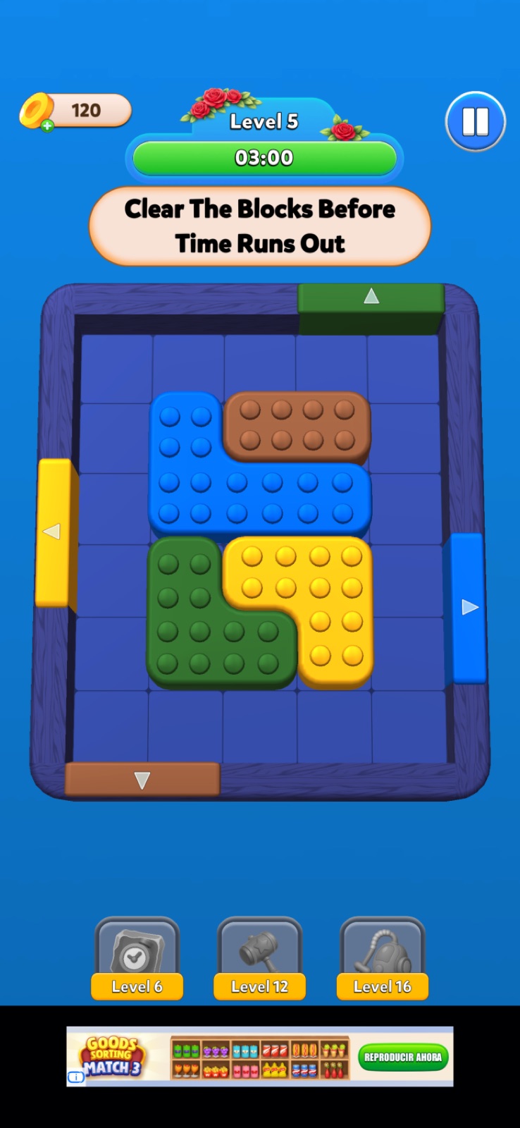
The level objective text is capitalized again — every word. The booster lock indicator this time has no padlock icon at all. Complete absence of UI consistency. Similar issues appear across every screen and text block in the game.
Daily Reward
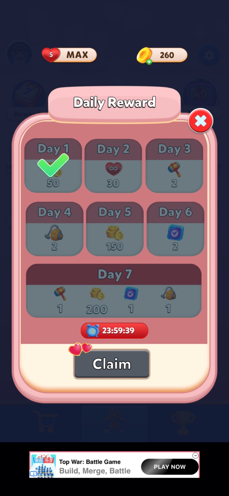
On the Daily Reward screen, the text at the bottom is partially cut off — again, as if the game was never tested. After collecting the reward, a cooldown timer appears: 24 hours. This means it's not tied to the next calendar day, but to a fixed time window.
An unusual choice, and a debatable one. It lets players gradually shift their reward collection time into the middle of the night — at which point they won't be able to collect it during the day at all.
Lucky Spin
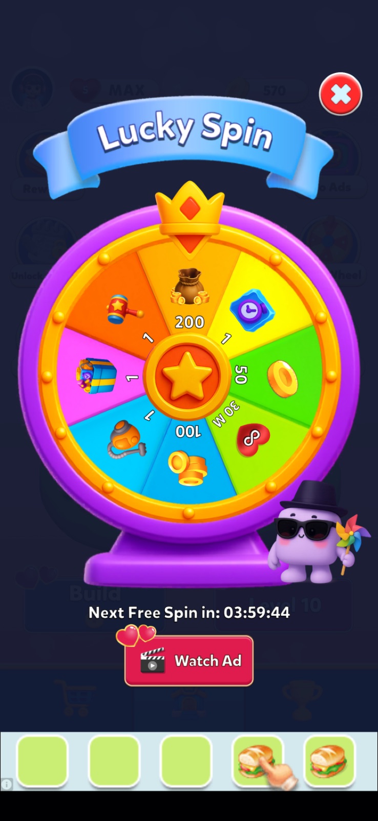
The Lucky Spin mechanic also has a cooldown — 4 hours — but this timer is not visible from the outside. The spin wheel icon on the main screen shows no marker when a free spin is available again. This might be intentional since the wheel is always accessible for an ad watch. But a visual marker for the free spin attempt would be a meaningful improvement.
Rate Us
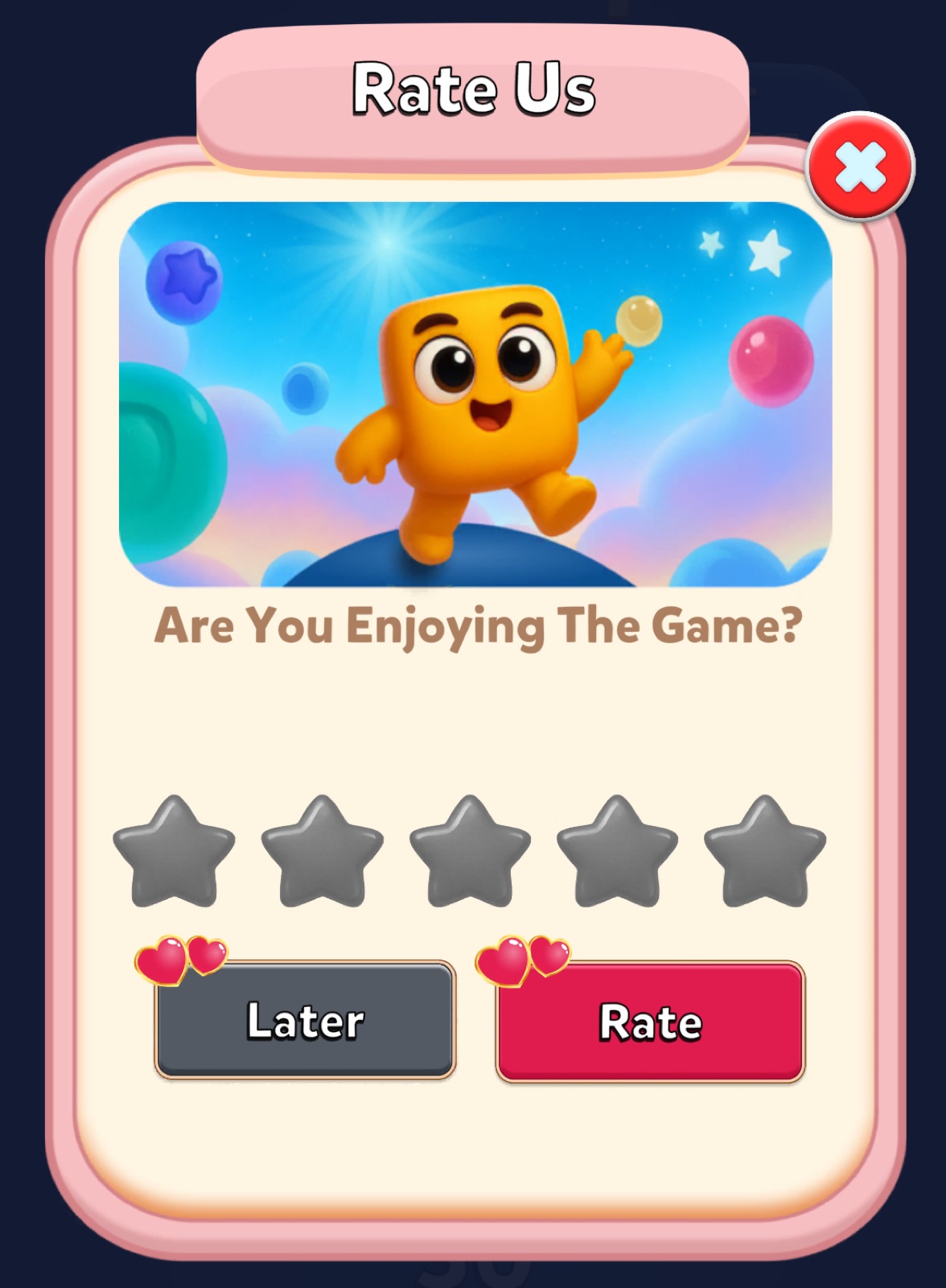
The Rate Us prompt doesn't follow best practices either. The standard approach is to pre-select 5 stars and simply ask the player to confirm. Here, nothing is pre-selected — as if leaving a rating is optional and unimportant. On top of that, the "Later" button duplicates the × close button. It's just a redundant element that adds noise without any function.
Fail Screen
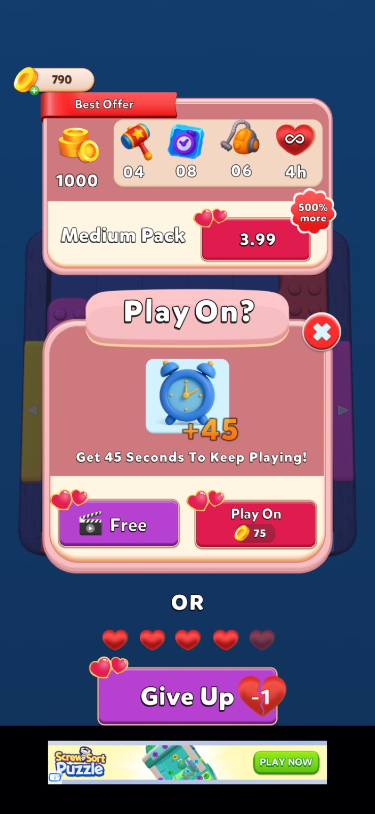
The fail screen has all the traditionally expected elements: a bundle upsell, ad-based monetization, coin spend option, and a life cost on decline. But the button inconsistency strikes again. This time the button actually spends coins — which is even more confusing than before, because at this point I already expect it to give me 75 coins.
Notification Markers
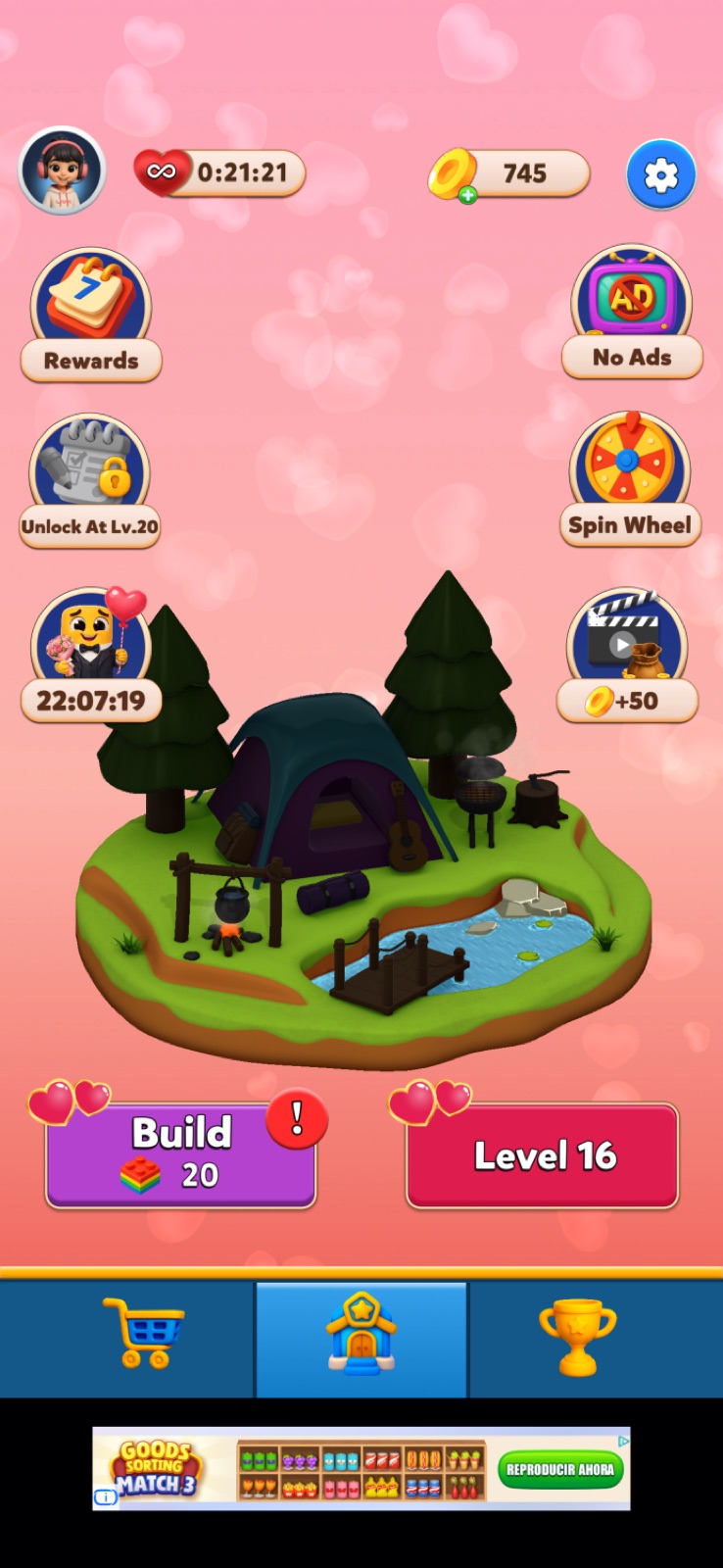
After unlocking the construction feature, it becomes clear that notification markers for icons do exist in the game — they're just not applied consistently across the UI.
Daily Quests
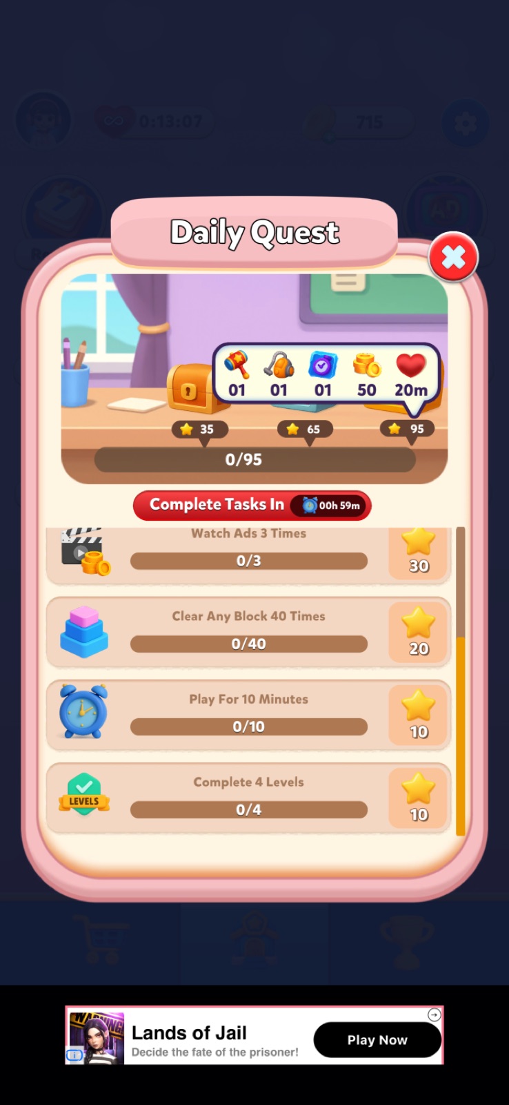
Daily quests have their own issues. The list isn't sorted by completion progress, and a reward for a finished quest can be hidden off-screen with no indicator. The tooltips on reward chests feature the same strange number formatting as everywhere else.
League Mechanic
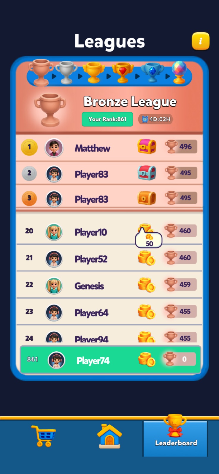
The League mechanic is a welcome addition — but for some reason, the coin reward amounts aren't shown directly on the screen. You have to tap to see a tooltip, even though there's plenty of space to display the numbers inline.
Postscriptum: The Red Buttons Were a Valentine's Theme
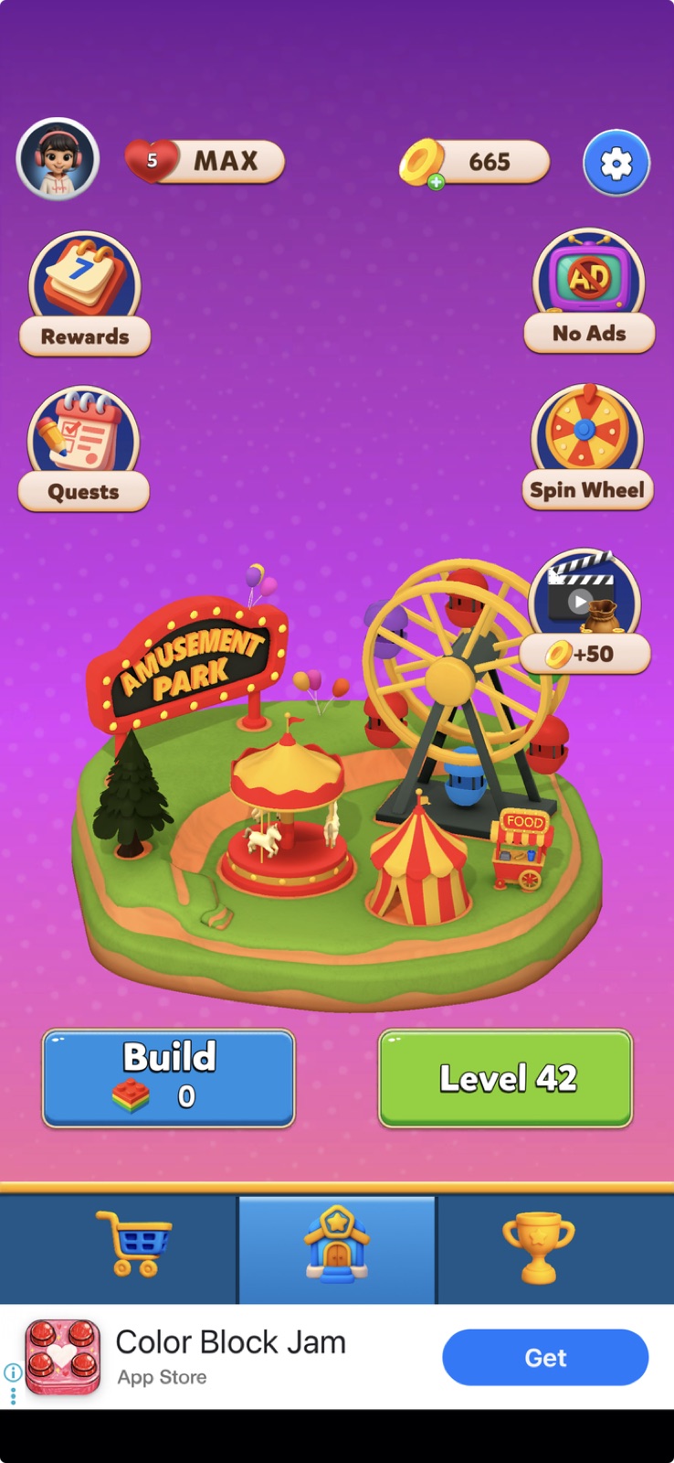
A detail that only became clear later: the red buttons weren't a permanent design choice — they were part of the Valentine's Day color scheme, paired with the heart icons on the price tags. Once the holiday ended, the buttons returned to a pleasant green that I have zero complaints about.
That said, the holiday theming still raises a question of degree. The heart icons alone would have been enough to set the seasonal mood. Repainting the action buttons red — a color that universally signals "stop" or "danger" in UI — was unnecessary, and actively worked against the purchase intent the buttons are supposed to create. Festive atmosphere shouldn't come at the cost of basic UX.
Summary
Overall, the game plays well at its core. The level design is solid, there's real challenge, the difficulty curve is well-tuned, and it's clear the core gameplay received careful attention.
But everything surrounding that core looks and feels rushed — untested, and indifferent to standard industry practices. The capitalization issues, inconsistent button behavior, broken number formats, missing markers, and confusing UI patterns all point to a product that wasn't polished before ship. A relatively straightforward pass focused on consistency and UX fundamentals could dramatically improve the game's feel and perceived quality.
And you're more than welcome to get my book Game Shops: Ultimate Guidelines!
Get new teardowns by email
One email when a new shop teardown is out, usually twice a month. The numbers, what works, what I'd change. Unsubscribe in one click.
Game Shops: Ultimate Guidelines
300+ pages of shop frameworks, pricing math and real shop breakdowns. Everything behind the teardowns on this site.
Get the bookSample shop report
A real Game Shop Snapshot: the top 5 issues in a live game's shop, the numbers behind each one and the order to fix them in.
Download the sample
Michael Khripin has spent 25+ years in online games: LiveOps, monetization and production, including Wargaming R&D and LiveOps on Hero Wars Mobile at Nexters. Author of Game Shops: Ultimate Guidelines. Runs New Perk, a game shop and LiveOps consultancy.